
Insights
Helping not-for-profit organisations develop and sustain
the highest levels of employee and volunteer engagement
Insights
 You’ve analysed your survey data – and maybe dived deeper with more sophisticated analysis – but it can be challenging to know how best to communicate that data. Getting the data visualisation right will make your survey results more engaging, more digestible and more accessible.
There are six key principles of data visualisation that you should consider.
Firstly, you need to know who you’re communicating with. Staff townhalls, working groups, managers, HRBPs, leadership teams and CEOs will all be looking for different things in the survey results, so tailoring the way you present the data can make a real difference.
Think about how much of the background your audience already knows – do you have to start from the beginning, or can you dive into the data? Think about how confident they are talking about data – are there some key definitions you can include, or any ways to talk less in terms of numbers, and more in terms of people? And think about how much detail your audience needs – a ‘helicopter’ view, a comprehensive overview, or a deeper dive into their area of focus?
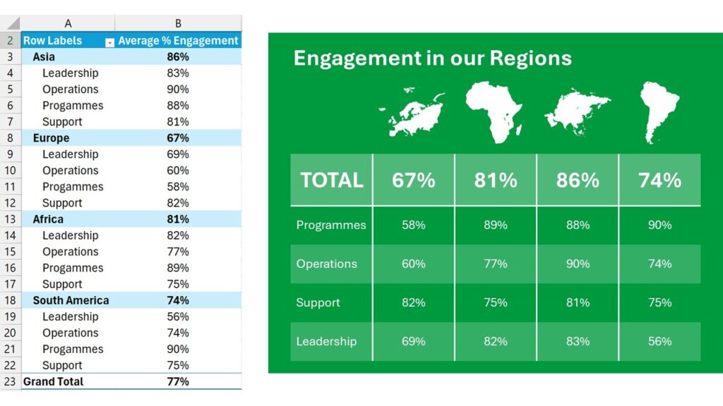
The answers to these questions will change the results you present, but it can also change the way you present the same results. In the graphics below, I’ve presented the same results – levels of engagement by part of the organisation – in two different ways: a raw pivot table for the Excel-savvy, and an infographic more suitable for everyone else.
This is always a good mantra, but especially when you’re visualising data. Your aim should be to avoid overcomplicating, and to make your visualisation as clean and accessible as possible. Reducing the ink on the page also reduces the visual and cognitive load for the audience, and means they can more easily engage with the actual results.
There are a few easy and pragmatic ways to do this.
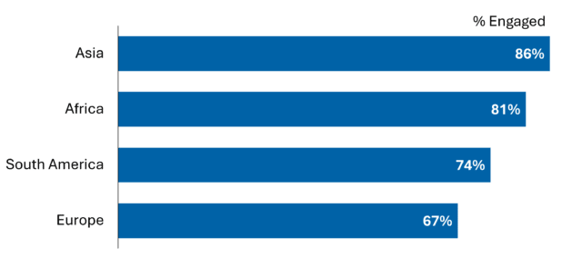
It might seem obvious, but using colour is a powerful way to immediately convey meaning in a mass of survey data. Colour is a visual channel that we are very sensitive to, and it attracts our attention like nothing else. A pop of colour is a great way to draw attention to the key datapoints.
Make the most of existing associations, so that your audience can interpret the visual without having to cognitively process it – for example, almost everyone immediately recognises green as good and red as bad. Your organisation might have its own internal colour associations, e.g. for particular regions, services or workstreams.
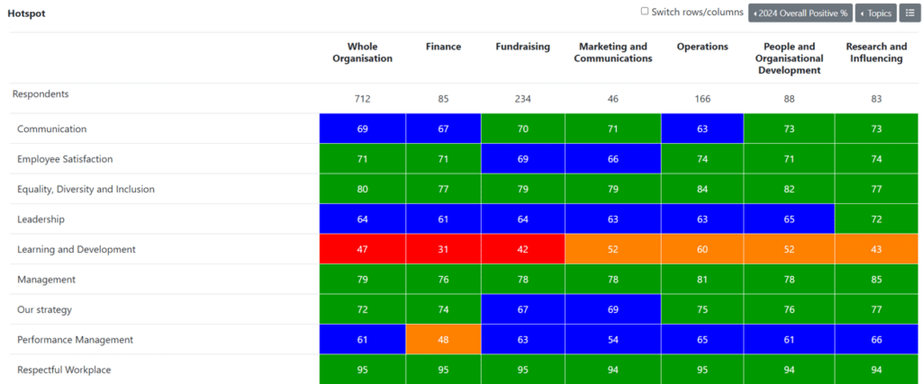
Colour can improve any visualisation. The heatmap below is driven by colour: every topic in the survey has a traffic light colour, and we can see how that colour varies by department.
Especially when there is a lot to take in from a set of results or a particular visualisation, it is valuable to explicitly state the key takeaway or the call to action. This might be through:
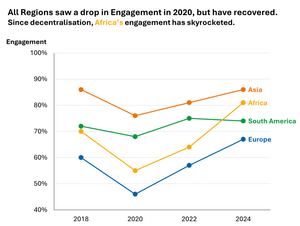
Most charts don’t need a title, despite what we were taught at school, and a punchy summary cuts through and adds much more value than something like “Engagement by Region over time”.
You can go further than this and remove everything that isn’t part of the key narrative, or leave it in your visualisation but grey it out – make sure that your audience’s focus is directed to where it’s most important.
Interactive dashboards have a lot of advantages as a way of sharing data. They empower you and your colleagues to freely investigate the survey results, and make the most of infographics and colour. This makes it easy to see key differences and insights.
If you don’t have a dashboard, interactivity can also be achieved with a well-prepared slide deck or an accessible spreadsheet.
There are some advantages to static documents and visuals:
Depending on your audience and your goals, an interactive or static format might be more appropriate.
There is no denying that data can seem dry, so using storytelling to present and communicate your survey results can help to make them more accessible.
By weaving in a narrative – where have we come from, what do we know, and where could we go next – you can make it easier for people to understand, engage with and act on survey results.
By combining your survey data with its context, verbatim comments, your understanding of what’s driving results and input from key stakeholders, you can translate your data into a story.
A story makes it easier for your audience to digest complex information, and to imagine what comes next – how obstacles might be overcome and how the organization can continue to grow.

Is your organisation applying these 6 principles when communicating survey results? How could the presentation of results be more impactful by using these data visualisation principles?
We’d love to hear from you – get in touch to speak with a survey expert at Agenda about the analysis and reporting of your people surveys.

Author
James Gurd, Senior Research Consultant


5 Linford Forum
Rockingham Drive
Milton Keynes
MK14 6LY
UK
Company No: 4509427