
Insights
Helping not-for-profit organisations develop and sustain
the highest levels of employee and volunteer engagement
Insights
In a previous blog we walked through the basics of survey data analysis: finding the overall positive score for each question, grouping questions into topics, and comparing the results for different groups.
In this blog we’re going deeper! We’ll demonstrate 6 techniques that will help you to dive deeper into your data. You’ll be able understand the relationships and connections between your data, and get more mileage out of your people survey results – whether you’re measuring engagement, wellbeing, or inclusion.
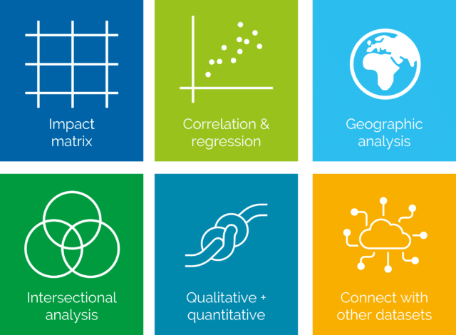
The 6 techniques are:
An impact matrix is a simple tool that will allow you to see the relationship between two questions, and the possible impact that one has on another. For example, what is the impact of feeling disconnected from leadership on employee engagement?
Create a grid like the one below. Work out the positive score on your ‘outcome’ question for those who feel a) positively and b) negatively on your ‘input’ question (the variable you’re interested in as a possible cause).
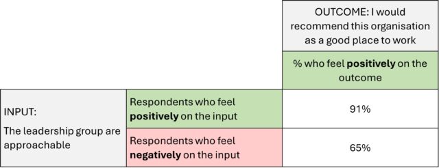
In this example, 78% of staff would recommend their organisation as a good place to work, i.e., are engaged. However, when we split people out by whether they feel that the leadership group are approachable or not, there is a clear relationship. People who feel that their leadership are approachable are, on average, 26% more engaged. Of course, this could be because people who are more engaged feel more able to approach their leaders.
Impact matrixes like this can be a powerful tool to see the relationships between questions, without having to do any complex analysis. They make the differences between groups of staff stark, so that you can build a narrative around employees’ different experiences.
Correlation and regression are two ways to measure the strength of the relationship between two variables: e.g., two questions or two topics from your survey.
Correlation is the simpler approach, and it can be done in Excel and many other tools. In the example below, we have correlated our key metric (the engagement question: I would recommend this organisation as a good place to work) with every other question in the survey.
Correlation gives a number between +1 and -1. A correlation of +1 indicates that the variables are perfectly positively correlated: an increase in one is associated with an increase in the other.
A correlation of -1 indicates a perfect negative relationship: an increase in one is associated with a decrease in the other. A correlation of 0 indicates that there is no linear relationship.
This example shows the questions with correlations that were 0.4 or greater – this is a commonly used threshold in social research for a medium-sized relationship.
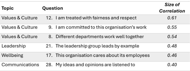
From this data, we can see that the questions which have the strongest relationship to engagement are Q8, Q9 and Q12, which are all from the Values & Culture topic. If performance on these questions were to improve, we would expect engagement in the organisation to increase.
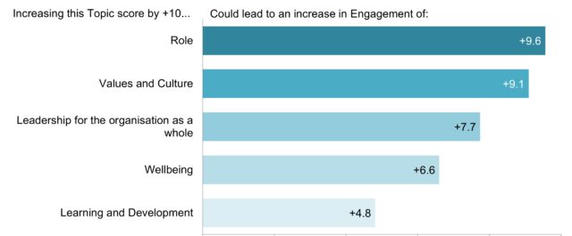
Regression is a more sophisticated technique, but is powerful because it answers a question that we often hear: where do we need to prioritise change to increase our employee engagement?
Performing regression requires a statistical package like R or IBM Statistics. It is a way of predicting the outcome of one variable given a change in another: for example, how much engagement might increase if the Role topic improved. Regression is a method of quantifying this cause-and-effect relationship, and understanding which of those ‘causes’ are the most significant.
In the example below, we have looked at the relationship between survey topics and engagement. The chart shows, for the 5 survey topics, how much engagement might increase if that topic were to increase by 10 percentage points.
It might seem obvious, but if you have employees or volunteers spread out across different geographic locations – sites, counties or countries, it could be revealing to compare your survey results for each of those locations.
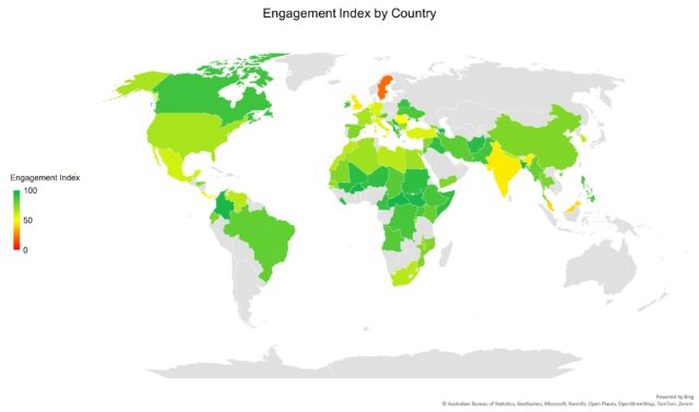
We often find that survey positivity varies internationally. Anecdotally, we’ve found that staff in Headquarters locations tend to be less positive than those in country offices, and respondents in Western Europe are less positive in general than other regions.
If you’re able to, visualise the results by location in a map: this will bring the spatial relationships to life, and help you to uncover hidden patterns in the data.
When you have your results for each region or location, you can compare this data against other sources – for example, if you’re running a wellbeing survey you could use the World Happiness Report.
Connecting with other datasets is extremely powerful in providing context to your survey results, whether that’s comparing against last year’s results or using external benchmarking data.
Our cultural understanding of intersectionality – the overlapping and interdependence of personal characteristics – has grown as Diversity & Inclusion has moved up the agendas of more and more not-for-profits. But it isn’t just D&I data that can be better understood through an intersectional approach.
To make a real difference where it is needed, it is often helpful to identify which groups would benefit the most from support. If you’ve included a good set of demographic questions in your survey, you’ll be able to disaggregate results and understand how staff experiences vary according to the interactions between:
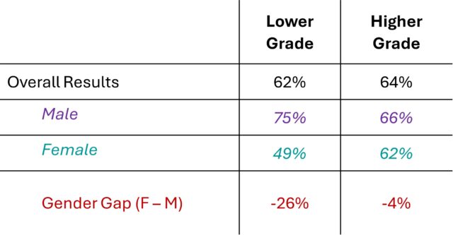
Intersectional analysis is important because it reveals interactions that are hidden when data is viewed in isolation. For example, although lower and higher grade staff might be similarly positive on a survey topic, it could be the case that there is a bigger gender gap for lower grade staff than for higher grade staff:
You can’t get this kind of insight without taking an intersectional approach to your data. Exploring different combinations can be time-consuming, but we’d recommend taking the time to freely explore your data – ideally in an interactive form like our Reflections dashboard, because it makes the process quick and easy.
Once you’ve got a feel for the most important interactions, focusing your further analytics on those key intersections of interest – for example between age, gender, ethnicity and team.
Your survey has probably given you two sets of data: the quantitative – how many people agreed or disagreed, what proportion are aware of your services, etc. – and the qualitative – verbatim feedback in response to open, free-text questions.
Both of these datasets are powerful. Quantitative results are less open to interpretation, can be combined and disaggregated easily, and open up many avenues of analysis. Qualitative data give you evidence of what people love about your organisation and what they might change in their own words. These personal, verbatim comments can share compelling perspectives and bring new ideas into the spotlight.
When you’re sharing numerical data, use a qualitative comment to bring it to life:
“35% of staff feel that departments do not work effectively together, and that number is higher for staff in Operations. One colleague commented that ‘Siloed working…is making us all less productive. We need all need to share more information, starting with managers.’”
Equally, when you are sharing your analysis of qualitative comments, support that feedback with the quantitative data:
“Many of the comments related to wellbeing services: ‘I miss the lunchtime yoga classes’, ‘I would enjoy my role more if I had the opportunity to work outdoors’. Wellbeing was one of our lower-performing topics, at only 62% overall positive.”
Qualitative and quantitative data appeal to different audiences, so tying them into one narrative can help to develop a shared understanding of the data and make your insights clearer.
 Although engagement surveys provide valuable data, they won’t give you the whole picture. We always provide our clients with comparisons to our external benchmark data. Seeing your organisation’s performance relative to your peers’ helps to interpret your results, and set informed priorities.
Depending on your organisation, you might have access to other relevant external benchmarks – for example from your particular subsector, your membership organisation, or salary benchmarking data.
As well as these external benchmarks, you can glean more insight from your survey data by pairing it with your internal datasets – for example, metrics of service quality, turnover, sickness absence, salary benchmarking and internal service use.
Because survey data deals in perceptions, it’s always valuable to compare with the hard data you have to understand whether you need, for example, a change to your policies or just an awareness campaign.
I hope some of these ideas inspire you to push a little deeper in exploring your results, and uncovering actionable insights. And if you’d like to discuss any of these techniques or share any that have worked well in your organisation – get in touch!

Author
James Gurd, Senior Research Consultant


Agenda Consulting
Belsyre Court
57 Woodstock Road
Oxford
OX2 6HJ
UK
Company No: 4509427